VISUAL IDENTITY DESIGN
Imperial Food Packing approached us to elevate their position as a reliable, quality-driven co-packing service provider in the UK food industry. Despite robust operations, from procurement to warehousing, their visual identity wasn’t reflecting that professionalism or standing out in a crowded market.
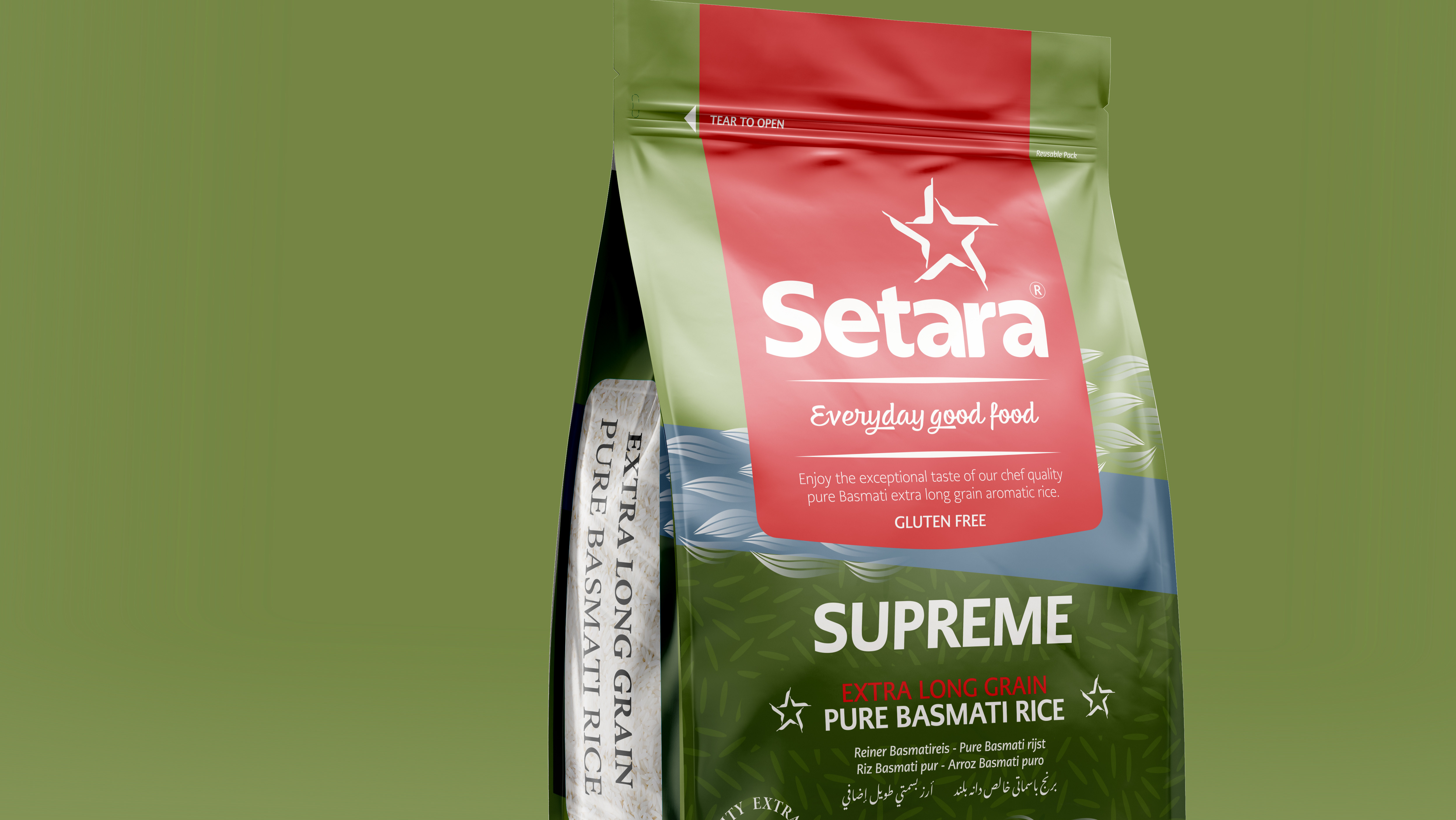
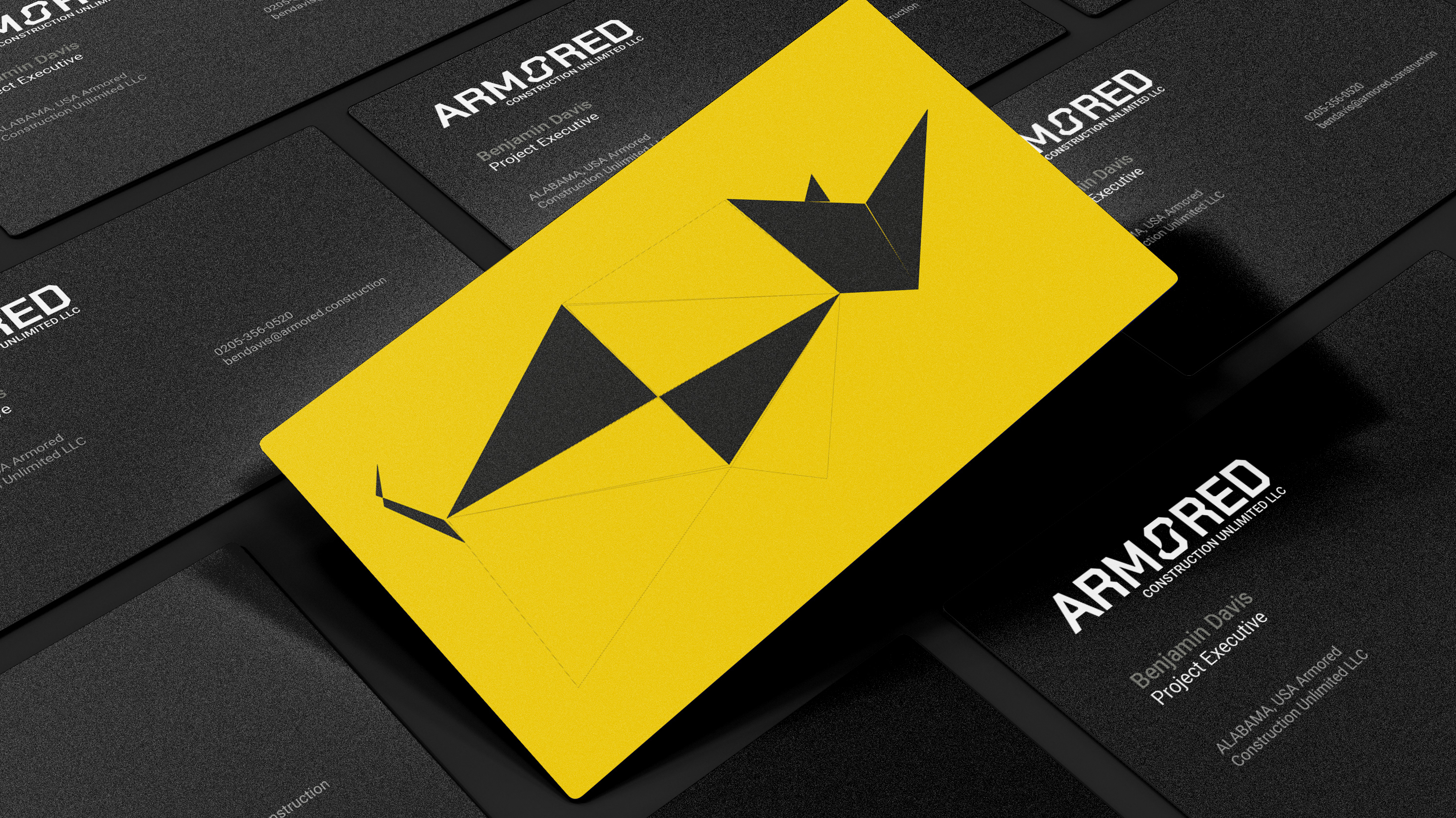
Through Studio 2 Ltd, we led a full brand transformation, starting with strategy and crafting an identity system grounded in precision and credibility. Every brand element, from the logo and typography to packaging mockups, was designed to communicate consistency, quality, and reliability at a glance.
RESULTS & IMPACT
Improved Market Credibility:
The new identity clearly signals Imperial’s operational rigour and trustworthiness to potential clients in the dry food supply chain.
Enhanced Client Acquisition:
Stronger visual positioning helped Imperial stand out in B2B sourcing searches and partnerships.
Consistency Across Touchpoints:
From packaging to corporate documentation, every visual asset now reflects professional polish and brand cohesion.
Better Shelf Appeal:
Updated mock-ups and branding materials gave Imperial a more professional presentation when pitching to brands and retailers.
---
CLIENT
Imperial Food Packing Ltd ® | Pack, Brand & Ship | Food co-packing
LED BY: Jamshed Aziz, Founder & Strategic Design Thinker
CREATIVE PRACTICE:

Ready to take your brand to new heights? Let's create exceptional together! Reach out today to explore the journey of Imperial Food Packing® and other inspiring brands we've worked with.


